Logo & Illustrations
Exploring ideas, refining design to the right direction, and building strong brand identities.
Logo Design
PHOENOS a.k.a PHENOS
Medical Marijuana Shop in Thailand, Prawet
Brand Concept
The client chose PHOENOS as the brand name because it represents his personal favorite strain. The one he considers exceptional and the best strain in the world.
Reference: Click Here
Exploration
I explored visual directions that could communicate the brand’s young, fresh, natural, and confident personality. The initial research focused on organic forms, botanical motifs, and marijuana leaf imagery.
Brand Color
The brand color must be in cool color like green or blue. I prefer green for young, fresh and natural style.



Refinement
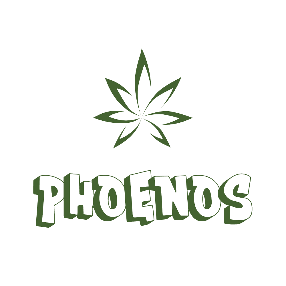
I refined the concepts by combining a stylized botanical leaf with custom typography, aiming for a mark that felt distinctive while still communicating the natural character of the brand.


Final Logo
The final direction combines the PHENOS wordmark with a subtle leaf element, creating a youthful, recognizable identity with a strong connection to nature. The client changed the brand name into PHENOS


Dark & Light Applications
I tested the final identity across dark and light backgrounds to make sure the logo remained clear, balanced, and recognizable in different brand environments.
Design Rationale
Young & Fresh → Soft organic forms and vibrant green tones create a youthful personality.
Natural & Eco-Conscious → The botanical element reinforces the brand’s connection to nature.
Distinctive → Custom typography gives PHOENOX a more ownable and memorable identity.
Logo Design
DOLLED COLLECTION
Clothing Business Page on Facebook
Brand Concept
The client wanted a minimal, clean, and feminine identity for her Facebook page. During the process, the brand name evolved three times.
From BEARY → MUSE TO WEAR → DOLLED by SILA
So the identity needed to adapt while keeping a consistent visual direction.


Exploration
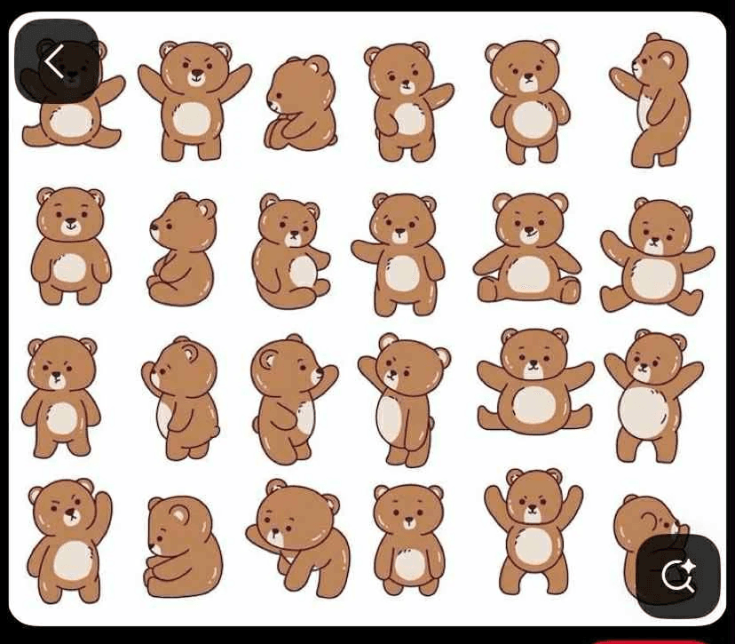
I explored different brand directions based on the client’s changing names and personality.
For BEARY, I experimented with bear-inspired visuals and character elements. As the brand evolved, I explored more fashion-focused and feminine typography for MUSE TO WEAR and DOLLED.
Refinement
After the naming direction became clearer, I moved away from the heavier character-based concepts and focused on a minimal wordmark with elegant, girly typography.The goal was to make the identity feel fashionable, feminine, clean, and easy to recognize on social media.


Final Logo
The final DOLLED by SILA identity uses a refined, feminine wordmark with a soft visual personality. The design keeps the logo simple and memorable while giving the brand a more polished fashion/lifestyle feel.
Design Rationale
BEARY → MUSE TO WEAR → DOLLED by SILA
Character-led → Fashion-focused → Minimal & Feminine
Logo Design
yaRia Win
Trading Card Game Store
Brand Concept
A playful brand identity created for a trading card game store, with the visual direction evolving through client feedback.




Exploration
The client initially requested a logo featuring a Celebi-inspired character illustration. I explored character composition, typography, color, and layout to create an energetic identity suitable for a trading card game audience.
Refinement
After completing the first direction, the client changed the character preference and requested a Dragon Knight-inspired character instead. I adapted the illustration and refined the composition while keeping the established yaRia Win wordmark and overall brand direction.


Final Logo
The final logo uses the Dragon Knight-inspired character with the yaRia Win wordmark. The combination creates a bold, playful, and energetic identity that fits the trading card gaming space.


Client Evolution
Initial direction: Celebi character
↓
Client feedback: Requested a Dragon Knight character
↓
Final direction: Dragon Knight + yaRia Win
I’d Love to Build What’s Next.
Give me a problem, and I’ll happily feed it to my brain until I find something worth building.