AYAPay Mobile Wallet 2.0 Fintech Super App
Redesigned core wallet experience and key financial flows to improve usability, clarity, and user trust across the platform
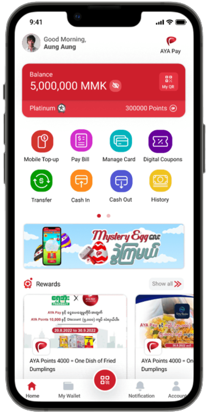
Role: UI/UX Designer
Platform: Mobile App
Scope: Wallet, Payments, Loyalty, Merchant
Improved usability and streamlined key financial interactions across the app.
Product Overview
Digital mobile wallet developed by AYA Bank for convenient and secure everyday payments.
Enables users to transfer money, pay bills, manage cards, and make digital payments from their mobile devices.
AYAPay 2.0 focused on simplifying core user journeys and improving overall usability.
Redesigned key user flows and interactions to create a faster, clearer experience.
Introduced new features to support users’ everyday financial needs.
Improved usability, accessibility, and visual clarity across the application.
Strengthened the overall product experience to encourage higher user engagement and adoption.
Supported AYAPay’s growth to 1M+ users across Myanmar.

Problem Overview
Users struggled with complex navigation and unclear payment flows
Low trust in transaction feedback
Loyalty and features lacked clarity and discoverability

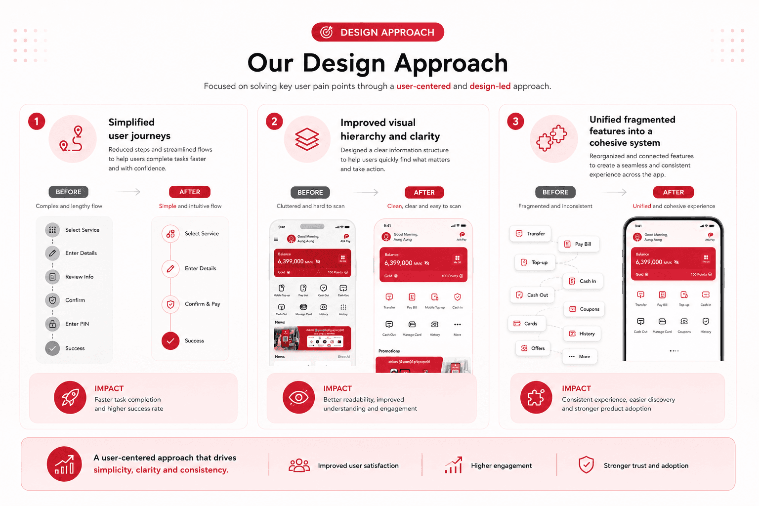
Design Approach
Simplified user journeys
Improved visual hierarchy and clarity
Unified fragmented features into a cohesive system
My Role
As a UX/UI Designer, I worked closely with product managers, developers, and business teams to design and improve key features within the AYAPay ecosystem.
My responsibilities included -
User flow design
Interface design and prototyping
Feature design for fintech services
Usability improvements across the app
Design iteration based on feedback
Collaboration with engineering teams during implementation

Design Process
My design process for AYAPay followed a structured product design workflow.
(i) Research (Empathize)
Uncovering user needs, financial behaviors, and market gaps through qualitative and quantitative research.
(ii) Product Strategy (Define)
Synthesizing insights to frame problem statements, align business objectives, and define key feature goals.
(iii) UX Design (Ideate)
Mapping user journeys, building information architecture, and sketching core interaction flows.
(iv) UI Design (Prototype)
Translating wireframes into high-fidelity visual interfaces and interactive prototypes.
(v) Testing & Feedback (Iterate)
Validating prototypes through usability testing and product team reviews to identify gaps and refine solutions.
(vi) Release & Continuous Loop (Launch & Learn)
Deploying the application while gathering post-launch data looping back to research, redefine, and re-ideate as new user insights emerge.

Key Features I Designed
During the AYAPay 2.0 overhaul, I owned and contributed to several high-impact product features designed to scale user engagement, improve conversion rates, and streamline operational efficiency.
AYAPay:
Mobile Wallet Application 2.0 (AYA Bank)
Home Screen & Basic Features
AYA PAY
is a mobile-first digital wallet powered by AyeYarWaddy Bank and developed by AYA InnovationLabs. It offers a range of services, including mobile top-up, bill payments, fund transfers, cash-in/out through agents, and QR code payments at over 19,000 merchants. The app is designed for ease of use, allowing users to manage their finances conveniently via mobile. It supports features like linking bank accounts, prepaid card top-up, and Visa/MPU card integration. Additionally, the app simplifies payments at participating merchant & agent locations by allowing you to scan and pay for goods and services with ease.
The target audience includes individuals who rely on mobile devices for banking, payments, and financial transactions. The primary user base consists of individuals aged 18 to 60, who rely on digital financial solutions for payments, money transfers, and managing their accounts.
Team Structure
Team Leader (Full-stack Developer): Oversaw the overall technical strategy and integration of front-end and back-end functionalities.
4 Front-End Developers: Focused on implementing the user interface and ensuring seamless interaction and visual appeal.
2 Back-End Developers: Managed server-side logic, database management, and integration with front-end services.
3 DevOps Engineers: Ensured smooth deployment, continuous integration, and efficient operation of the app in various environments.
2 Business Analysts: Conducted research, gathered requirements, and provided insights into user needs and business objectives.
Product Manager: Coordinated project timelines, resource allocation, and communication with stakeholders.
3 QA Testers: Performed rigorous testing to identify and address issues, ensuring the app’s quality and functionality.
Product Owner: Provided vision, prioritization, and overall direction for the project, aligning development efforts with business goals.
During my tenure at AYA Pay, I was responsible for a diverse range of design tasks, including:
Visual Design: Crafted engaging and user-centric visual elements to enhance the overall aesthetic and usability of the app.
UX Research: Conducted in-depth research to understand user needs and behaviors, driving informed design decisions.
Interaction Design: Designed intuitive and seamless interactions to improve the user experience and functionality of the application.
UX/UI Design: Developed comprehensive user interfaces and experiences that align with the app’s goals and user expectations.
Motion Design: Created dynamic motion graphics to add visual interest and improve user engagement.
3D Design: Designed 3D assets and elements to enrich the app’s visual appeal and interaction.
Graphic Design: Produced various graphic assets, including icons, banners, and illustrations.
Illustration: Developed custom illustrations to support the app’s branding and enhance user experience.
Short Animation GIFs: Created animated GIFs to provide visual feedback and engage users in a more interactive manner.
The AYA Pay mobile application, backed by AYA Bank, operates in the banking and fintech industry, offering a digital wallet solution tailored for users in Myanmar. Targeting a diverse audience aged 18 to 60, the app facilitates digital financial services such as payments, money transfers, and account management.
Currently, the application is experiencing significant usability and performance issues that lead to a suboptimal user experience. Users report difficulties with navigation, transaction management, and accessing essential functionalities such as account linking and QR code payments. Furthermore, the app's interface does not meet contemporary design standards, making it less competitive in the rapidly evolving digital wallet market.
To address these challenges, a comprehensive redesign and functionality enhancement are essential. This project aims to modernize the app's interface, streamline user interactions, and improve overall performance. The goal is to deliver a more intuitive and user-friendly experience that aligns with user expectations and industry best practices, ensuring the app remains competitive and relevant.
Research Phase: AYA PAY Mobile App Revamp
The research phase aimed to understand user needs, evaluate existing functionalities, and gather insights from competitors to guide the redesign of the AYA Pay mobile app.
Methodologies
1.
Competitor Analysis
Conducted a thorough analysis of leading mobile financial applications such as KBZpay, Wave Money, and True Money.
Evaluated their features, user interfaces, and user experiences to identify strengths, weaknesses, and opportunities for differentiation.
2.
User Research
Engaged with current users through surveys and interviews to gather feedback on pain points and desired features.
Analyzed user feedback to understand common challenges and expectations.
3.
Usability Testing
Conducted usability tests on the existing app to identify friction points in navigation, transactions, and feature access.
Documented issues related to the app’s interface and performance.
4.
Industry Trends
Researched current trends and best practices in mobile financial applications to ensure the redesign aligned with industry standards and user expectations.
Findings
1.
Competitor Insights
Competitors offered advanced features and intuitive designs that provided a benchmark for enhancements.
Identified areas where AYA Pay could improve its functionality and user engagement.
2.
User Feedback
Users reported difficulties in navigating the app and managing transactions efficiently.
Common requests included a more modern design, easier access to key functionalities, and additional features.
3.
Usability Issues
The existing app had several usability challenges, including a cluttered interface and performance inefficiencies.
Application of Research:
1.
Feature Enhancement
Used insights to prioritize and design new features, ensuring they addressed user pain points and matched competitive standards.
Examples include streamlining transaction processes and introducing more intuitive navigation.
2.
Design Modernization
Revamped the user interface to align with contemporary design trends and improve overall usability.
3.
Regulatory Considerations
While exploring innovative features like loyalty point transfers, ensured compliance with Central Bank of Myanmar regulations to avoid project termination.
Outcome: The research phase provided a solid foundation for the app’s redesign, helping to create a more user-centric and competitive mobile application.
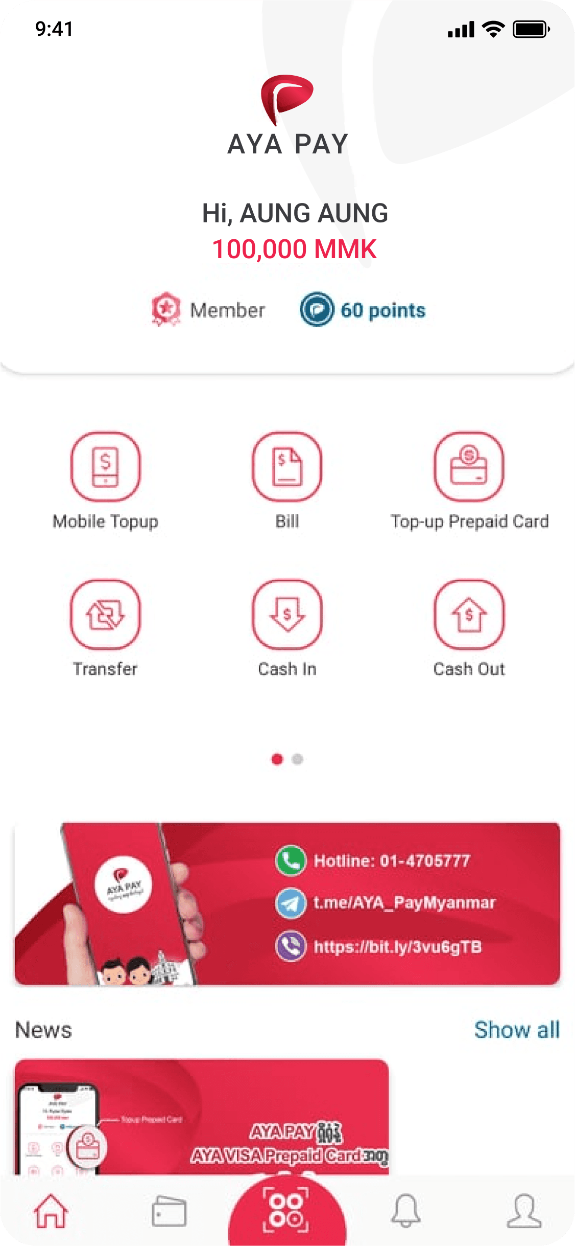
Fig: Old UI
Define the Objectives
Defining clear objectives is essential for guiding the project and measuring its success. For the AYA Pay mobile app revamp, the objectives were:
1.
Clearly State Objectives
Enhance User Experience: Improve the app’s usability by redesigning the interface to be more intuitive and user-friendly. Streamline navigation and transaction processes to ensure a seamless experience.
Modernize Design: Update the app’s visual design to align with contemporary standards and create a more engaging and visually appealing interface.
Expand Functionality: Introduce new features and functionalities based on user feedback and competitive analysis, such as enhanced transaction capabilities and improved integration with payment systems.
Improve Performance: Optimize the app’s performance by addressing existing inefficiencies and ensuring faster load times and smoother interactions.
Ensure Regulatory Compliance: Ensure that all new features and functionalities comply with regulatory requirements set by the Central Bank of Myanmar (CBM).
2.
Define Success Metrics
User Satisfaction: Measure improvements in user satisfaction through surveys, feedback, and app store ratings. Aim for a specific increase in positive user feedback and app ratings.
Usability Improvements: Track the reduction in user-reported issues and difficulties related to navigation and transactions. Utilize usability testing metrics to assess enhancements.
Feature Adoption: Monitor the adoption rate of newly introduced features. Measure how frequently users engage with new functionalities and assess their impact on user experience.
Performance Metrics: Analyze app performance metrics, such as load times and response times, to ensure that optimizations result in tangible improvements.
Compliance and Risk Management: Verify that all new features adhere to Central Bank of Myanmar regulations and minimize the risk of regulatory issues.


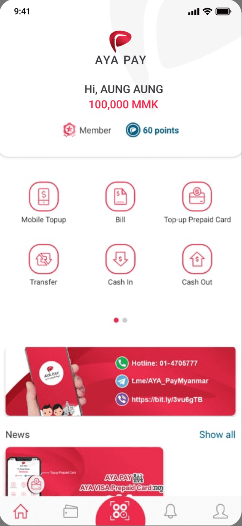
Fig: AYA Pay Old UI & Log In Flow
According to research, I created two personas for AYAPay.
User Persona 1
Name:
Thandar Tun
Age:
28
Occupation:
Small Business Owner
Location:
Yangon, Myanmar
Tech Proficiency:
Moderate
Goals:
Thandar wants a simple, fast, and reliable way to manage her payments for her online business, send money to suppliers, and receive payments from customers.
Frustrations:
Slow app loading times, difficulty in finding the right features, and a lack of notifications for transaction updates.
Motivations:
Convenience, security, and instant access to her financial records
User Persona 2
Name:
Kyaw Min
Age:
22
Occupation:
University Student
Location:
Mandalay, Myanmar
Tech Proficiency:
High
Goals:
Kyaw wants to use AYA Pay for quick cash transfers to friends, mobile top-ups, and paying for items at local merchants using QR code payments.
Frustrations:
Complicated navigation, difficulty linking his bank account, and inconsistent customer support.
Motivations:
Speed, ease of use, and staying up-to-date with his financial activity through notifications.

FIg: Empathy Map for User 1

FIg: Empathy Map for User 2
We utilize Agile methodologies, including Agile UX and User-Centered Design, to develop features and integrate billers. While backend and developers continue working with the existing UI, we engage in brainstorming, research, and testing to improve the user experience. We reference Confluence to identify essential fields and data required for the interface, ensuring that every element is strategically placed to enhance usability and meet user needs effectively. Below is an example of the essential data fields required for SkyNet Biller integration.

We reviewed the previous Information Architecture (IA) of AYA Pay and conducted a comparison with competitor financial applications by analyzing their structures. The IA comparison is as follows:


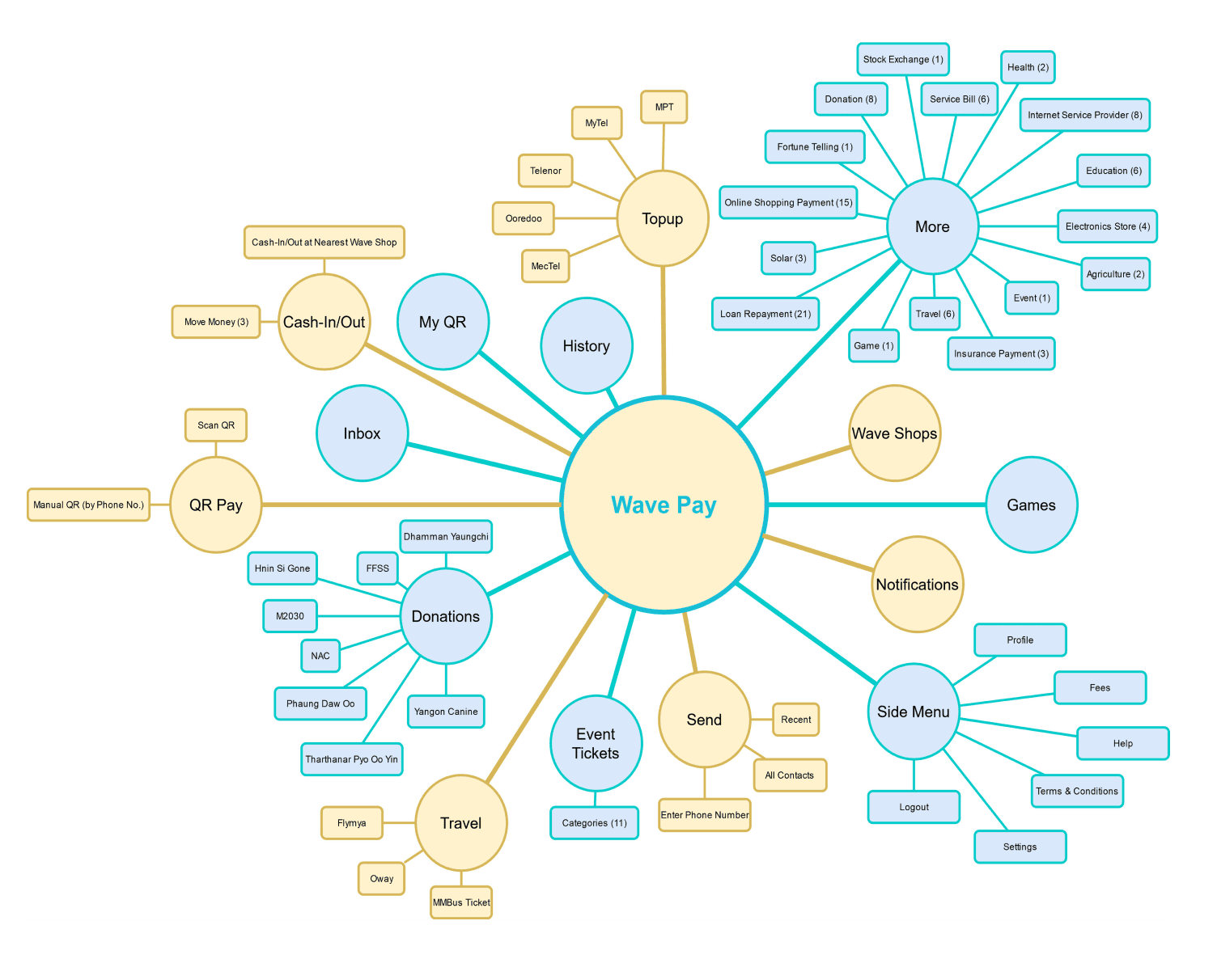
After reviewing the previous Information Architecture (IA) of AYA Pay, we conducted a detailed comparison with competitor financial applications, focusing on optimizing functionality throughout the AYA Pay mobile app. The IA comparisons between AYA Pay and other apps are summarized below, highlighting key structural and functional differences to enhance user experience.

Figures: Functionality Comparison

Figures: Functionality Comparison (Strengths for each application)

Figures: Basic Needs for KYC Registration

Figures: Comparison for AYAPay & other mobile wallet applications
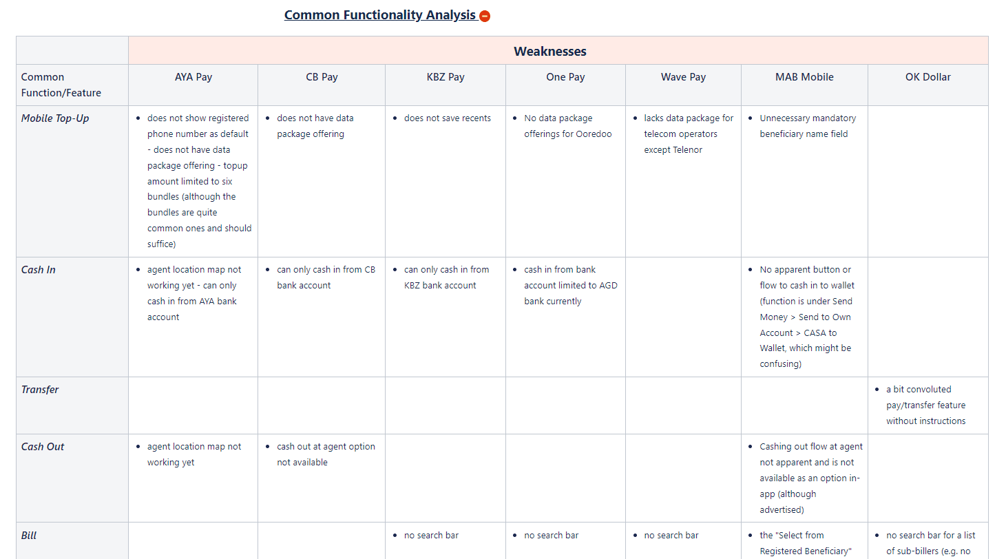
Figures: Important Functions, Basic Functions and eKYC Comparisons
Defining Basic Functions
Defining basic functions for a web or mobile application is crucial for creating a clear and organized framework for development. After comparing AYA Pay with competitor financial applications, we identified key functions to be added in the new version. These functions include:
Enhanced security features
Improved QR code payment integration
Simplified user registration and login flows
More efficient transaction tracking
Support for additional payment methods and currencies
A more intuitive navigation system tailored to user feedback
Visual improvements to increase usability and consistency across the app.
These updates aim to improve functionality and user experience. The key functions are -
Mobile Top-up
Pay Bill
Manage Card (New)
Digital Coupons (New)
Transfer
Cash In
Cash Out
History
Insurance (New)
Donations (New)
Request Transfer (New)
Prepaid Card Top-up (New)
Bay Din/ Astrology (New)
Travel (New)
Credit Card Repayment (New)
Core Features
These updates aim to improve functionality and user experience. These are the default features.
User Authentication
Sign up, log in, log out
Password reset, account recovery
User Profiles
View and edit user profile
Profile picture upload
Dashboard
Overview of user activity, key metrics, or notifications
Content Management
Create, edit, delete content/ ads/ functions and others
Notifications
In-app notifications, send email notifications, Automatic notifications
Settings
User preferences, app settings
Help & Support
Access to FAQs, support tickets, contact forms
Mobile Top-up
Top-up mobile bills
Pay Bill
Bill Payment such as electricity bill, and other integrated business partners.
Wallet
Linked with AYA Bank Account to deposit/ withdraw from/to AYAPay Account.
Cash In (Deposit)
Deposit funds from Linked Bank/ Visa/ Master
Cash Out (Withdraw)
Withdraw funds at Merchant/ Agents
Transfer
Transfer funds between internal users
Top-up Prepaid Card
Top-up AYA Bank Credit Card
Scan & Pay
Purchase with Scan QR at AYAPay Merchants
Who are we?
We are the AYA InnovationLabs team, a division of AYA Bank (the second-largest bank in Myanmar, with KBZ being the first). We primarily use Agile methodologies, including Agile UX, for sprint planning, research, and iterative design development. Additionally, we apply Lean UX principles to form hypotheses and develop up-to-date AYA Pay financial applications. Whenever possible, we implement User-Centered Design (UCD) practices to ensure we deliver the best possible user experience to our customers.
Emphasize
Define
Ideate
Prototype
Testing
(Developement)
Testing
(Production)
Release
Fig: Our process flow of Design Thinking and UX
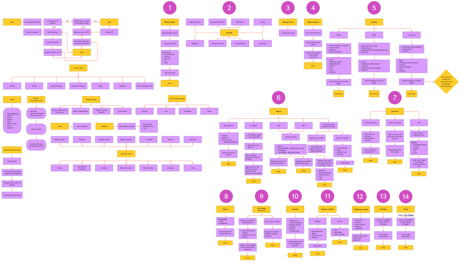
Fig: Information Architecture for AYAPay (Revamped)
Low Fidelity Prototype Example


Creating Icons
Version 0 featured the old icons, while in Version 1, I redesigned the icons with a slightly thicker stroke. The increased stroke weight makes the specific functions more visible and easier for users to identify.
Fig: Home & internal icons (Version 0)
Fig: Home & internal icons (Version 1)
In version 2, I updated the colors into two different one. So that the user can choose and memorize the specific one. In Version 3, I inverted the colors and implemented filled colored icons, making them more intuitive and easier for users to remember and recognize quickly.
Fig: Home & internal icons (Version 2)
Fig: Home & internal icons (Version 3)
In Version 4, I reduced the color contrast to enhance the visual appearance of the icons, making them more visually appealing and easier on the eyes while maintaining their functionality and recognizability. I assigned fixed colors to each function, allowing users to associate and remember specific functions based on the color, further enhancing their ability to quickly identify and use the app’s features.
Fig: Home & internal icons (Version 4) - Final
I conducted research, gathered user feedback, and reviewed the old Information Architecture to guide the UI revamp. I created three different UI options for the Home Screen and conducted A/B testing. I applied color theories from the Canva color wheel, starting with the brand color red, and incorporated all five color theory approaches into the Home Screen design. The results clearly showed users preferred Screen C over Screen A & B, mainly because Screen B had excessive red and high contrast.
Additionally, I switched from a three-grid layout to a four-grid layout, drawing on Miller’s law regarding memory capacity. Using color-coded icons helps users associate colors with functions, reducing the need to read labels. However, the challenge lies in icon color selection, considering the number of icons, future additions, and varying cultural color meanings across countries.
Screen C as a Solution:
Screen C addresses our persona’s pain points and gains by utilizing colored icons to improve functionality. The use of distinct colors for different icons reduces the difficulty users face in locating key functions, thereby minimizing frustration and enhancing efficiency for user persona 1. This visual differentiation streamlines navigation and makes it easier for users to quickly identify and access the features they need.

Fig: Version A

Fig: Version B
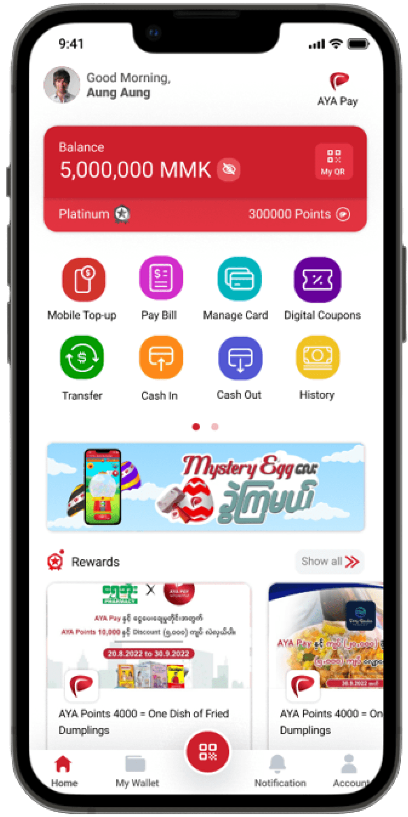
Fig: Version C
AYAPay Log In Redesign

End of the AYAPay Home Screen UX UI
6.1 Core Onboarding & Security
6.1.1 Splash Screens, Onboarding & Log In Authentication
I redesigned the AYA PAY onboarding and authentication experience to make account creation faster, clearer, and more secure for new users.
Core Flow
Splash & Welcome → Introduce AYA PAY and guide users into onboarding.
Mobile Number → Enter and verify the phone number with OTP.
Create PIN → Set a secure 6-digit PIN for account access.
Biometric Login → Optionally enable fingerprint authentication for faster login.
Terms & Conditions → Review and accept required agreements.
Onboarding Complete → Welcome users into the AYA PAY app.
Challenges
Security vs. simplicity: Make authentication strong without creating unnecessary friction.
Multi-step onboarding: Keep several verification steps easy to understand and navigate.
Error prevention: Reduce mistakes during phone number, OTP, and PIN entry.
First-time experience: Build trust and confidence from the very first interaction.
Faster conversion: Minimize drop-off while maintaining a secure onboarding process.


6.1.2 KYC Verification System
I designed a streamlined KYC verification experience to help staff review customer applications and approve or reject them efficiently.
Flow:
KYC Request → Review Details → Verify Documents → Approve / Reject → Confirmation
Challenges
Complex verification: Present multiple customer details and documents without overwhelming staff.
Efficient review: Reduce the steps needed to process each application.
Status clarity: Make pending, approved, and rejected applications easy to distinguish.
Error prevention: Provide clear confirmation before completing approval or rejection.


6.2 Transaction & Core Payment Infrastructure
6.2.1 Core Payment System
I designed and refined the core payment experience to support AYA PAY’s everyday financial transactions across multiple services.
Core Payment Functions
Mobile Top-Up — Quickly recharge mobile accounts.
Transfer — Send money securely to other users.
Deposit & Withdraw — Move money between wallets and bank accounts.
QR Payment — Enable fast, contactless payments through QR codes.
Bill Payments — Pay utilities and other bills in one place.
Card Management — Manage payment cards securely.
Challenges
Complex ecosystem: Bring multiple payment services into one consistent experience.
Transaction clarity: Make balances, fees, status, and confirmation easy to understand.
Security: Balance fast interactions with secure authentication and verification.
Scalability: Create reusable patterns that can support new payment services over time.

6.2.1.1 Mobile Top-up
I designed a simple and efficient mobile top-up flow to help users recharge their phone balance quickly and securely.
Flow
Enter Details → Add the recipient’s mobile number and select the operator.
Choose Amount → Provide quick-pick amounts for faster top-ups.
Choose Operator → Choose the operator of the mobile number.
Confirm & Proceed → Review the number, operator, and selected amount before continuing.
Success → Provide clear confirmation once the top-up is completed.
Challenges
Reduce input effort: Make frequent top-ups faster with auto-detected details and preset amounts.
Prevent errors: Help users verify the phone number, operator, and amount before payment.
Keep it secure: Protect financial transactions while keeping the flow simple.
Design for scale: Create a reusable pattern that can support different operators and future top-up options.


6.2.1.2 Transfer
I designed a unified transfer experience that lets users send money through Wallet, NRC, and Cashcode with a clear and consistent flow.
Flow
Choose Transfer Type → Select Wallet, NRC, or Cashcode.
Enter Details → Add the recipient and transfer amount.
Review & Confirm → Verify recipient, amount, and transfer details.
Success → Show immediate confirmation with transaction details.
Challenges
Multiple transfer methods: Create one consistent experience across different transfer types.
Reduce errors: Validate phone numbers, NRC details, and recipient information before submission.
Simplify complex inputs: Minimize manual entry and use smart defaults where possible.
Build trust: Make review, confirmation, and transaction status clear for every transfer.
Consistent experience: Keep the interaction predictable across all transfer options.


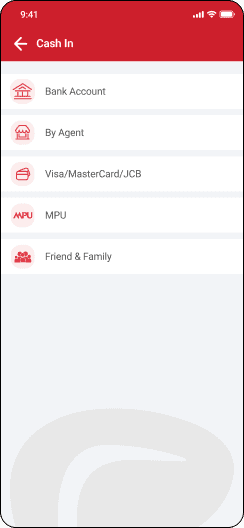
6.2.1.3 Deposit & Withdraw
I want short text explanation in bullet points. Also add challenges that I faced. explanation for Transfer function for AYAPay.
Deposit (Cash In)
Choose Method → Select Bank Account, Agent, Card, MPU, or Friend & Family.
Enter Amount → Add the amount to deposit.
Add Details → Provide the required account or payment information.
Review & Confirm → Verify the method, amount, fees, and destination.
Success → Show immediate confirmation and updated wallet balance.
Withdraw (Cash Out)
Choose Method → Select Bank Account, Agent, or ATM.
Enter Amount → Specify the amount to withdraw.
Choose Destination → Select the target bank account or cash-out location.
Review & Confirm → Check the transaction details before submitting.
Success → Confirm the withdrawal and display transaction details.
Challenges
Multiple methods: Create one consistent flow across different deposit and withdrawal methods.
Complex information: Keep account, card, and agent details easy to understand.
Fee transparency: Make fees and total amounts clear before confirmation.
Error prevention: Help users verify the destination and amount before completing the transaction.
Trust & security: Provide clear confirmation and status feedback for financial transactions.


6.2.1.4 QR Payment
I designed the QR payment experience to make merchant payments fast, simple, and secure, while supporting both scanning and receiving payments.
Core Flow
Scan QR Code → Scan a merchant QR to make a payment.
Show QR Code → Display your personal QR to receive payments.
Review & Confirm → Verify payment details before completing the transaction.
Payment Complete → Provide clear confirmation after a successful payment.
Challenges
Speed & simplicity: Reduce the steps needed to complete a QR payment.
Security: Use dynamic QR codes and expiry states to reduce misuse and fraud.
Dual-purpose flow: Support both paying and receiving within the same experience.
Poor scanning conditions: Add flash and gallery support for easier QR scanning.
Voucher integration: Allow users to apply vouchers without interrupting the payment flow.


6.2.1.5 Pay Bills
I designed the bill payment experience to help users discover, select, and pay bills quickly across multiple service categories.
Core Flow
Choose Category → Browse services such as telecom, transportation, utilities, and more.
Find Biller → Search or select a biller from the available providers.
Enter Details → Provide the required account or payment information.
Review & Pay → Confirm the bill and payment details before completing the transaction.
Success → Provide clear confirmation and transaction details.
Challenges
Many billers: Organize a growing number of services without overwhelming users.
Faster discovery: Make it easy to find a specific biller through search and categories.
Scalability: Design a structure that can support new billers and categories over time.
Consistency: Keep different bill-payment flows familiar and easy to understand.
Trust & security: Make payment details and confirmation clear before users commit.


6.2.1.6 Manage Cards
I designed the card management experience to give users clear control over their virtual card, from setup and top-up to security and transaction tracking.
Core Flow
Card Overview → View card details, balance, spending, and credit information.
Add / Top Up Card → Select the amount, choose a funding source, and confirm the top-up.
Lock / Unlock Card → Instantly lock the card for security and unlock it when needed.
Transaction History → Review card transactions and spending activity.
Card Status → Provide clear success, locked, and transaction states.
Challenges
Complex card information: Present important details without overwhelming the user.
Secure top-ups: Make funding and confirmation easy while maintaining trust and security.
Fast security controls: Allow users to lock or unlock their card with minimal steps.
Clear transaction visibility: Make spending and card activity easy to scan and understand.
Future scalability: Design the experience to support additional card types and features, including physical cards.


6.2.1.7 Biller Integration Framework
I designed a streamlined bill-payment experience that helps users discover, select, and pay billers across multiple service categories.
Core Flow
Discover Biller → Browse categories or search for a specific biller.
Select Service → Choose the required bill-payment service.
Enter Details → Provide the necessary account or customer information.
Review & Confirm → Verify payment details before completing the transaction.
Payment Success → Show a clear confirmation with transaction details.
A/B Testing
Design A — Category First: Prioritized category-based discovery.
Design B — Search & Discovery: Combined search with visible biller options.
Compared both approaches based on findability, speed, navigation clarity, and scalability.
Challenges
Large biller ecosystem: Organize many billers without overwhelming users.
Fast discovery: Help users find the right biller with minimal effort.
Scalability: Build a structure that can support new categories and billers.
Consistent payment flow: Keep different bill-payment journeys familiar and predictable.
Choosing the right direction: Use A/B testing to evaluate which discovery approach better supports user needs.


6.3 User Engagement & Gamification
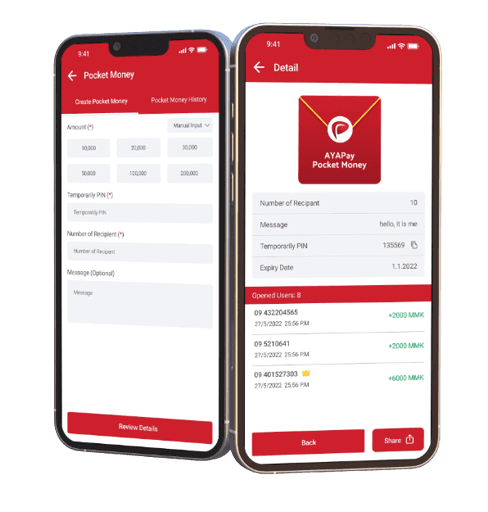
6.3.1 Pocket Money (Festival Gift Sharing)
I designed a digital pocket money experience inspired by Myanmar’s tradition of giving during festivals, making it easy to send and receive money remotely.
Core Flow
Create Pocket Money → Set the amount, number of recipients, PIN, and personal message.
Share Link → Generate a unique link and share it with recipients.
Secure Access → Recipients open the link and enter the sender’s PIN.
Receive Money → Recipients can view and claim their pocket money.
Track Activity → Senders can view pocket money history and transaction details.
Challenges
Cultural + digital experience: Translate a familiar festival tradition into a simple digital flow.
Two-sided journey: Design both the sender and recipient experiences as one connected flow.
Security: Protect shared funds with PIN verification without adding unnecessary friction.
Multiple recipients: Support group gifting while keeping setup simple.
Remote sharing: Make the experience work smoothly through a shared link, even when sender and recipient are not together.

6.3.2 Loyalty Program & Points System
I designed a loyalty program to reward everyday AYA PAY usage and encourage users to earn, redeem, and progress through membership tiers.
Core Experience
Earn Points → Users earn points through eligible transactions and activities.
Track Progress → View points, tier status, and progress toward the next level.
Redeem Rewards → Use points to unlock vouchers, discounts, and partner offers.
Tier Benefits → Higher tiers provide additional privileges and exclusive rewards.
A/B Testing
Version A — Gradient UI: Used tier-specific gradients to create a strong visual distinction between membership levels.
Version B — Illustration UI: Used custom illustrations to create a friendlier and more informative experience.
Final Direction: Selected Version B for better clarity, scalability, and easier implementation.
Challenges
Complex point rules: Translate business-provided point calculations and tier requirements into an easy-to-understand experience.
Tier clarity: Make membership levels and progress immediately understandable.
A/B comparison: Explore two visual directions while keeping the underlying experience consistent.
Scalability: Simplify the tier structure by removing the Bronze level and ensure the final design could support future rewards and benefits.


6.3.3 Mystery Egg Campaign
I designed a gamified rewards experience where users spend AYA Points to spin a Mystery Egg and receive random rewards.
Core Flow
Enter Campaign → Discover the Mystery Egg from the rewards section.
Spend Points & Spin → Use AYA Points for a chance to win.
Reward Reveal → Use animation and surprise to create excitement.
View Reward → See reward details, validity, and terms.
Redeem / Use Reward → Apply the reward or save it for later.
Challenges
Balance excitement & clarity: Make the game engaging without making the reward flow confusing.
Random reward system: Clearly communicate that rewards are randomized.
Point usage: Make the cost of each spin visible before users spend points.
Reward usability: Provide clear details on validity and redemption after winning.
Repeat engagement: Create a campaign experience that encourages users to return and use their points.

6.4 Operations, Merchant & Marketing Support
6.4.1 Staff Mode (Branch Approval System)
I designed a dedicated Staff Mode in AYA PAY to help branch staff review and process customer KYC and merchant onboarding requests efficiently.
Core Flow
Login → Staff member signs in with their AYA PAY account.
Switch to Staff Mode → Access internal approval tools from the user menu.
View Requests → See pending KYC and merchant onboarding requests.
Review Details → Check customer information and submitted documents.
Approve / Reject → Make a decision with clear actions.
Confirmation → Provide immediate feedback after the decision.
Challenges
Complex information: Make detailed KYC and merchant data easy to review.
Faster approvals: Reduce unnecessary steps in the staff workflow.
Clear status: Make pending, approved, and rejected requests easy to identify.
Error prevention: Ensure staff can review details before approving or rejecting.
Dual workflows: Support both KYC verification and merchant onboarding within one Staff Mode experience.

6.4.2 NPS Feedback System
I designed an in-app NPS survey to capture customer sentiment without disrupting the user journey.
Flow:
Trigger → NPS Score → Reason → Improvement Feedback → Submit
Key Challenges
Low friction: Keep the survey quick and easy to complete.
Actionable feedback: Connect scores to specific service areas.
Right timing: Trigger feedback after meaningful transactions.
Multiple states: Design for bottom sheets, text input, keyboard, and confirmation states.
Design Goal
Create a simple feedback loop that turns customer sentiment into actionable product insights.

6.4.3 AYAPay Merchant Application
I designed the merchant experience as an all-in-one business payment tool, allowing merchants to accept payments, request money, top up customers, and manage daily transactions from one app.
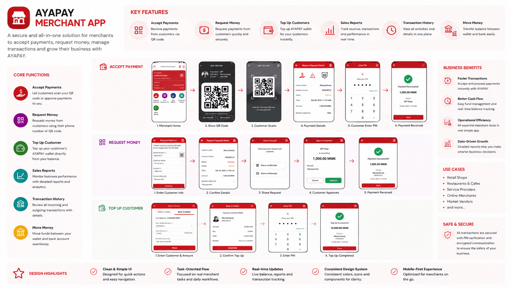
Core Functions
Accept Payments → Customers can scan the merchant QR code or approve a payment request.
Request Money → Merchants can create payment requests using a customer’s phone number or QR code.
Top Up Customers → Merchants can add funds directly to a customer’s AYAPAY wallet.
Sales Reports → Merchants can review revenue, transaction volume, and business activity.
Transaction History → Detailed records make it easy to review incoming and outgoing payments.
Move Money → Merchants can transfer funds between their AYAPAY wallet and linked bank account.
Key user flows
Customer Payment: Merchant QR → Customer scans → Reviews payment → Enters PIN → Payment completed
Request Money: Merchant creates request → Shares request → Customer reviews → Approves → Payment received
Customer Top-Up: Enter customer details → Enter amount → Confirm → PIN verification → Top-up completed
Design Focus
Simplified frequent merchant tasks into clear, action-oriented flows.
Used status feedback and transaction details to build confidence around financial actions.
Designed the experience around speed, transparency, and repeat daily use.
Kept the interface consistent across payment, reporting, history, and money-transfer workflows.
6.4.4 Marketing & App Store Assets
Produced high-converting application graphics and promotional banners to maintain brand consistency across user touchpoints.
Product Ecosystem

I’d Love to Build What’s Next.
Give me a problem, and I’ll happily feed it to my brain until I find something worth building.